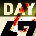
Project Scope:
The Wexner Center presents many film series, some of which benefit from targeted advertising promotions such as this one. These pieces are an exercise in the creation of visual harmony as they often include a very large variety of subject matter and styles. A strong information hierarchy and consistent graphic pallet are needed to thread these varied pieces of content into one cohesive mailer....Read More
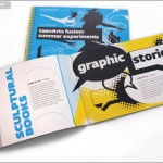
Project Scope:
The Wexner Center presents many films per year so a monthly film/video calendar  including curation notes and extra info was developed. This mailer was set to use a rotating series of three palettes of 2 colors in which the color mixed with black produce a wide range of design effects while keeping production cost low. This reductive palette also served to visually homogenize the broad variety of material which might be featured in a single months mailer....Read More
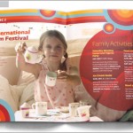
Project Scope:
The Wexner Center offers a summer seminar for teens which teaches them about self expression through film, graphic arts and music. The booklet serves as advertisement through participating school programs and includes a sign up form as well as including indicia area included on the back page for direct mail imprinting. I worked on this project for 2 years running and it was important that it resonate as a series while still appearing new and fresh for the current year....Read More
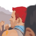
Project Scope:
The Wexner Center hosts a wide variety of theater, dance, film and music events. I created posters, handouts, flyers, postcards, program notes and web promotions for these events. I approached each of these projects as a unique design using photos and materials materials supplied by artists.
...Read More
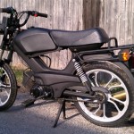
This is my moped project. I began this project last year with plans to move and leave my car. As purchased this was a full faring little bike which was fast but so trashy looking with the London emergency vehicle yellow paint job. I stripped that business down and started laying down a satin black finish. In the possible plans for the near future is a 70cc bore kit but much more likely a swap for a Sachs Madass 125. ...Read More
craft|
6.15.11|
Comments Off
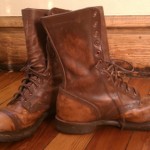
These are a pair of historic WWI era replica boots from Corcoran that I purchased on ebay with the intention of learning the art of leather distressing. I've used a combination of oils and sanding to get them back to more of a natural finish and wear pattern. They are a work in progress but I though I'd post a few pics of them as they stand just for fun.
 ...Read More
craft|
6.15.11|
Comments Off
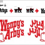
Project Scope:
Wendy’s and Arby’s, now jointly owned are expanding into the middle Eastern market and wish to construct shared kitchen space or hybrid restaurants in that region for the sake of efficiency. A new hybrid identity was needed as well as an Arabic version of the mark....Read More
This is a series of paintings that I've been working on in the last couple months. They are all on 48" tall masonite panels with acrylic and mixed media. The kiwi and the prehistoric kiwi skeleton are all illustration while the African child contains some elements of collage.
...Read More
craft|
6.15.11|
Comments Off
Project Scope:
Orange Julius is a brand in need of a refresh. Now, owned by Dairy Queen, the brand has lost much of their brand personality that it once had as a street cart business when customers would call out “an orange please, Julius!”. The original logo, for some reason or another also incorporated a devil character leaning on an orange.
...Read More
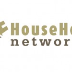
Project Scope:
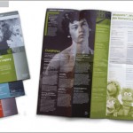
HHN was a startup web project offering a service similar to craigslist only focused on borrowing and sharing household items such as tools, spare furniture etc. I provided identity development and usage guidelines for web and print as well as marketing collateral....Read More
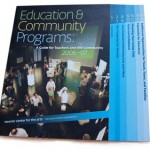
This publication was for use by educators to help them prepare for and schedule class events in cooperation with the arts center. I created this publication 2 years in a row. This was the first publication I had ever layed out with a waterfall spread. It made setting up the master pages very interesting.
...Read More
I had the opportunity to work on this icon for a tower defense style iPhone game featuring an endless barrage of zombie attacks created by game developers Avalinx. It was a fun little pure Photoshop illustration project applied to a very amusing theme....Read More
These are all vector illustrations created in years past. Some were ever done back in the years of Macromedia Freehand (I can claim street cred with the that back through the existence of Aldus Freehand 4.0). They are of friends mostly with a narcissistic self porttrait thrown in there just for good measure.
...Read More
hobby|
6.13.11|
Comments Off
Project
A friend was starting a custom computer sales and repair business and needed a brand package to get started. The logo is meant to show a reverence for technology, almost a worship of it if you will. The cool blue of the palette against the warm brown are meant to display the contrast between the mechanical and the organic....Read More
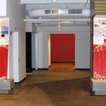
This display was created for the New Years season 2007 in the Lobby of the firm I was working with at the time. It featured sketches from the previous years work, pinned up on a backing board then a red field to which a grid of trace paper rolls was attached, spelling out the numerals "2007".
...Read More
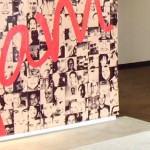
WD was creating an initiative to promote the work/life balance of their corporate culture. I created a series of posters to be displayed in one of the main office conference rooms and a display for the lobby which featured two 7' x 7' exhibition areas. The lobby display used portraits of all 300+ employees while the posters exhibited the special talents and hobbies of a few employees who had responded to a survey about outside interests....Read More